Thursday, November 29, 2012
Im a big fan of using stencils when it comes to artwork. A stencil is composed of two parts, the island and the bridges. Islands are sections of the material that are inside cut-out holes while bridges are narrow sections that are not cut out. There are many different ways to create and use stencil designs...you can find out here : http://naldzgraphics.net/design-2/how-to-create-stencil-designs/
My Works
I few works i did when i found myself to be bored.........
This is an ad i did In Photoshop for one of the worlds best soccer matches between Real Madrid and Barcelona
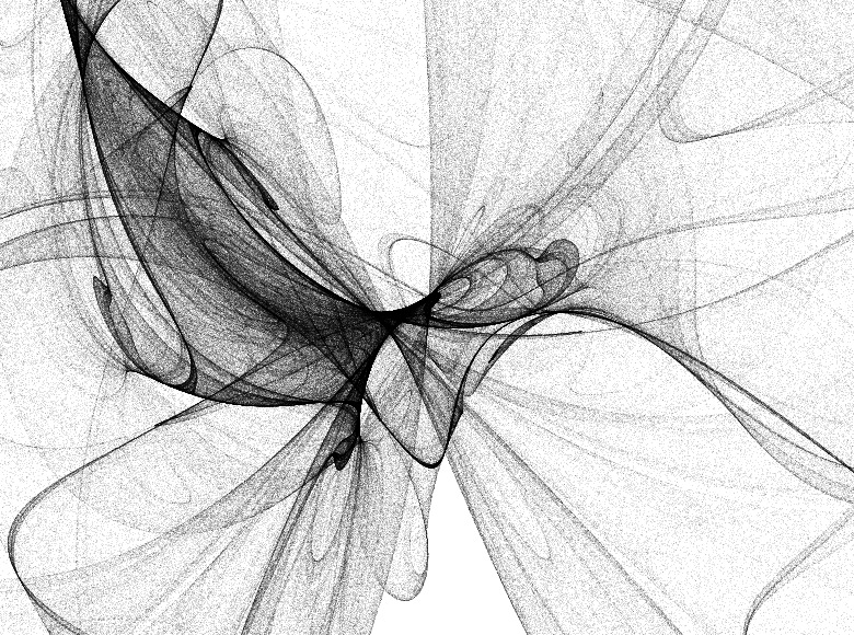
An Illustrator design working with brushes.
A photoshop design of Kat Von D
Self Taught
Sometimes I like to consider myself a self taught designer because a lot of times when I'm bored and i have absolutely nothing to do, I get on my mac and work on random designs using illustrator and photoshop. A lot of those times i learn new things and i can see myself growing as a designer. Here are a few works that i found to be amazing from digital artist David Fuhrer who is also a self taught artist.
Nature Art Defying Gravity
Art done with nature is one of my favorites. I like that these particular pieces have gravity incorporated into them instead of just usually sculptures. I admire the use of snowballs especially because it is not a medium used by many.
Rashad Alakbarov
This is some work by the artist, Rashad Alakbarov from Azerbaijan where he uses suspended translucent objects and other found materials to create light and shadow paintings on walls. I love found objects incorporated into art. This is definitely a refreshing way to see it done.
Left or Right Brained?
These images make it visually clear what the differences between left dominant and right dominant brains. I can easily say that I am right brain dominant. Although I am analytical and super organized, my strive for creativity and passion in everything I do outweighs everything.Which are you?
Color Schemes
I'm really into using the eyedropper tool in Illustrator so I like how this shows the color scheme of the object. It is important to be familiar with color schemes because sometimes your color is limited and you have to go by a specific scheme just as we did for SPEAK.
Well designed homes
I feel that as design students, we all have a strong sense of creativity and it will most likely translate into our future home decor. At least this is true in my cousin's loft in Brooklyn. He is a photographer and lives with two other artists and their loft is set up well, has a distinct style, and is filled with artwork. These are some photos of actual homes that I stumbled upon that I hope for my home to someday look like. That would be amazing.
Creating animals
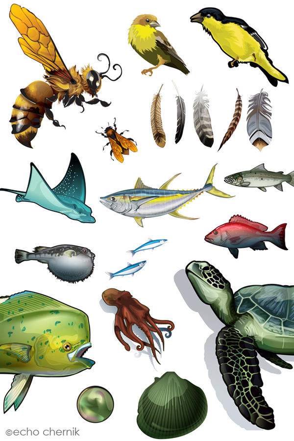
I was strolling deviantart.com and I found these amazing vector animals. They aren'y overly detailed but i find them really beautiful.
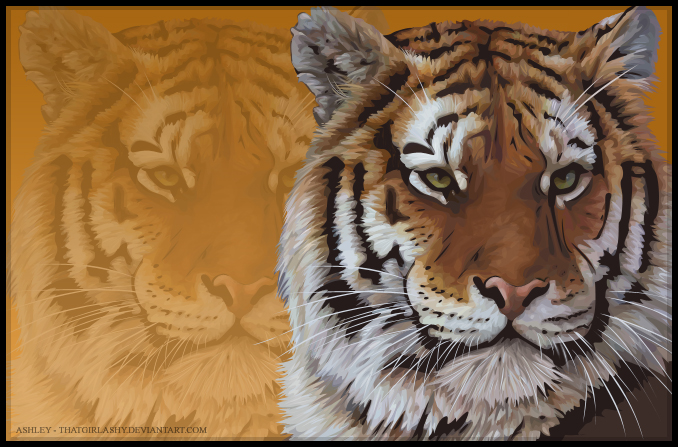
And then theres this tiger that I found. The detail of the fur is so amazing and I can only imagine how tedious it must have been to create this piece.
Tim's Q paper
In class Q taught
us a lot of cool techniques and shortcuts that we could use when designing
things like holiday cards, or logos, and how useful symbols can be. Out of all of the techniques and tips that Q
taught us about the ones that I thought were most important were, using
symbols, swatches/patterns, and color/work paths. Although Q went through a lot of techniques
the main thing I got from the workshop is to think outside of the box when
designing and don’t always listen to what your teachers tell you. In real world you’re not going to focused on
doing things “the right way,” you need to get your work done and it has to be
good.
Coming in to class
that day the only expectations that I had were that I was going to learn something
from Q. Whether it was about graphic
design or good tips to upcoming artists about how to get themselves into the
art world I knew I was going to come away knowing more. Being what I consider to be an experienced
designer and artist I was excited to know what she was going to tell us
about. Like her first visit Q made sure
to say hello to everyone in the class and see how everyone was doing. That’s something I focus on because I’ve gone
to artist talks where all the person does is go straight to their work or what
they’re going to teach which completely cuts off any good interaction with the
audience; also the fact that she is very friendly and welcoming helped.
Out
of all of the techniques that Q taught us, I thought that most interesting and
most important ones were when she taught us about symbols/patterns and color
paths. She taught us how to create
patterns and make them swatches and that when you make symbols to always save
them because they could come in handy for a later project. The other technique that she taught us was
about were color and work paths. This
technique would come in handy when we want to create graphics from photos or
other vector images. Color paths allow
you to grab certain colors and parts of an image. This comes in handy when you want to make a
photograph in to a vector image without image tracing the photograph. Color/work paths make it easier to make more
accurate representations of the originals for your designs.
All
in all I learned a lot from both of Q’s visits.
She taught the class how to “cheat” while still doing great design. She told us about a lot of great websites to
get ourselves into the art community and to keep making work; whether it’s your
best work ever or just some side design put your work out there. Although Q went through a lot of techniques
the main thing I got from class is to think outside of the box and that everything
your teachers tell you is not always right.
In real world you’re not going to be focused on doing things “the right
way,” you need to get your work done when it has to done and it needs to be
good.
Jennifer Pedersen for 11/27/12
Samy Halim is a french illustrator, website
I found illustrated animals extremely interesting after seeing more of Q's work and looking into more illustration of animals. I decided against posting more than one photo from Samy due to the fact that more of his images are on the website hyperlink and finding the images that catch your own eye is important, or i feel is important.
Stephanie Hagin - Q.
When Q. Cassetti came in for the workshop she showed the
class how to use many tools in Illustrator and some tools from Photoshop. Not only did she show us how to use the tools
that she prefers to use, but she also showed us some of her secrets for making
simple but attractive designs.
The first
thing she showed us was how to make a simple three colored object from an
image. Q. put the image she wanted into
Photoshop and used the ‘Color Range’ tool to select different colors. Once she exported each color from Photoshop
she could open them in Illustrator and put them together. This technique is very useful because you can
create a very accurate illustration of any complicated object, such as animals
or people.
Q. showed us
how to create any brush or swatch that we want and it is a lot easier than I
had expected. You can create any
pattern, shape, or lines in a document and drag them into the swatches panel or
brushes panel. This is beneficial
because if you have a pattern that you want to use in more than one object you
can just make it a swatch so that you can use it as a fill. It is also useful if you want to create
something such as hair because that way you can create your own strand of hair
to use over and over again. You can
also use this technique to create symbols by dragging an object into the
symbols panel. This way you can use
objects repeatedly while minimizing your file size.
One of Q.s
favorite tools to use or play with is the ‘3D Extrude & Bevel’. With this tool you can create bottles or
other curvy shapes. The nice part about
this tool is that you can place text that forms to the curvature or angle of
the object that you make 3D. This can
come in handy if your make an object such as a bottle that needs a label on it.
Q. showed us
a few ways to make text more interesting by using the ‘Envelope distort’ tool
and by making text a compound path. To
make text warp to an object you use the ‘Envelope distort’, one word or a whole
paragraph can be used for this and all the text will warp to fit within an
object that is above it. The other
technique is putting an image within the text.
In order to do this the text needs to be an outline and a compound path. Then you put a picture or whatever graphic
you choose behind the text. Create a
clipping mask and you will have a graphic forming to the shape of your text.
This workshop with Q. was extremely useful
because she has experience using these tools for her job. Her experience is noticeable as she knows
simpler techniques that create satisfying results. She did an exceptional job at teaching her
techniques to the class and I for one learned a lot.
Q's Workshop
-->
Kelsie Foster November 28, 2012
ATS 240
Writing Assignment #1
Illustrator
Q. Cassetti, offered up a lot of useful information, tips, and tricks as she took
the time to do a workshop for our graphic design class. I really admire her work and I am extremely
grateful to have witnessed her in the act.
With each aspect of Illustrator that she demonstrated to us, I took it
all in carefully and am confident that it will be valuable throughout my
creative education and will translate into my graphic design career. With over 25 years of visual art experience,
I respect and admire all she has contributed to the design world thus far.
First, Q’s design
is very well implemented in her conceptions.
She really has her style down and it is revealed nicely in her
work. She showed us numerous sketchbooks
that she starts with before going into any work on Illustrator. I like the fact that she does this because it
is familiar to me since that is how I was always taught. Expressing and playing around with your ideas
and plans on paper first is always a smart idea before ever touching a computer
and her sketchbooks made this evident.
Her designs tend to be very crisp, ornate, and visually descriptive. I like that she has such an established
design to her work and appreciate the fact that it shines through whether her
client is for a jewelry collection or for a wine label.
Second, during her
occupation, she has mastered logotype.
Logotype is an identifying symbol typically for use in advertising. According to her website, (qcassetti.com) she
has been actively involved for the following clients: Quest Diagnostics,
Steuben Glass, The Corning Museum of Glass, The Baker Institute for Animal
Health, Cornell University, Tiffany and Company, Estee Lauder, Origins Natural
Resources, Corning Incorporated, T. Rowe Price, Lightship Communications, Omega
One Communications, Nantucket Paper Chase, and Free Rein Wines. With all of her involvement with these
clients, she has truly learned exactly what logos are meant to be. She mentioned to us the more we illustrate in
Illustrator, the more we learn the tricks of the trade and become familiar with
what design really means to us. So, with
knowing the fact that she started out just like me and is a successful
designer/illustrator gives me hope that I will someday be able to execute my
design into work as well as she does.
Third, during her
workshop she demonstrated a variety of tools, shortcuts, and effects. As we all know by now, graphic design and
anything involved with it is extremely time consuming. So, when working, the main idea Q always has
in mind is how she can save herself time and make things easier. With that being said, one of the tools she
used a lot was the pathfinder tool.
Although it is a simple tool and known to many, she showed us how useful
it actually can be. What it does is combine
paths, divide objects, subtract shapes, etc.
Another act she taught us was making our simple designs and patterns
into brushes and adding them into our brush library for later use. Also valuable, was how she showed us how to
make a shape look three-dimensional by going to Effect-3D-Revolve. For example, when trying to show a client
what the label will look like on a wine bottle, this knowledge comes handy.
In conclusion, the
workshop with Q. Cassetti was indeed a treat.
She was able to build up my knowledge of the program, Illustrator. In addition to the knowledge she helped me
attain, she was also a joy to watch and listen to which increased my admiration
for her as not only a designer but a person as well.
-->
Subscribe to:
Posts (Atom)


